- Stock
- String
- Scale
- Shape
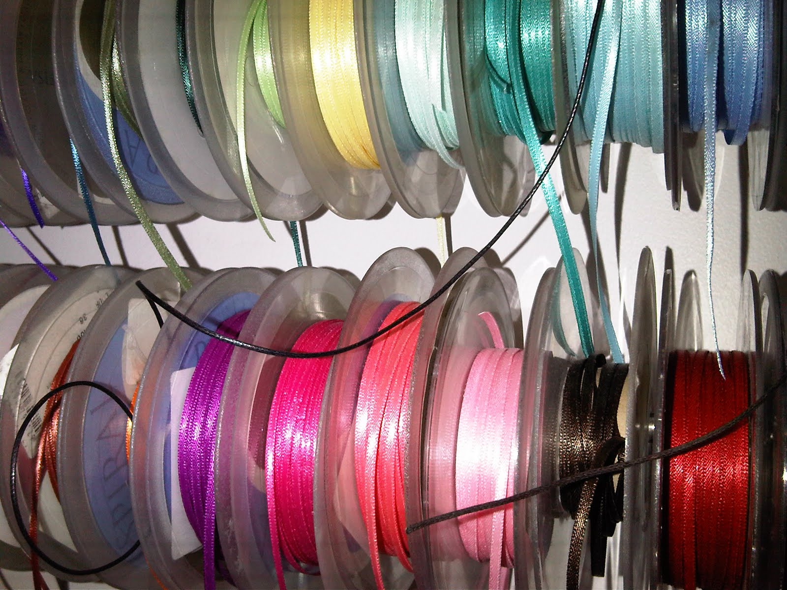
After giving my ideas a little more thought, I felt how I attached them was really important and chose to try and find some really nice ribbon that would work well with the products and the stock I printed on. I was a little bit overwhelmed with the amount of choice i had once I started to look. Eventually I chose a thin light brown to keep it 'bread like' and that wasn't too overpowering against the tag design.
(I felt a little bit like a kid in a sweet shop when looking through the choice!)

These are my most recent photographs of the new Hovis tags. These are my final designs and will be attached onto the final products. below are the tags on their own. I'm really pleased with the way that they've come out. They just make that extra touch I wanted. The initial tag idea for them to be in the shape of the logo worked, but was a bit obvious and boring for me. I also wanted to try and exploit my illustrations a bit more and apply them to another product.


No comments:
Post a Comment