Thursday, June 3, 2010
Evaluation of Brief
I feel this brief definitely had it's ups and downs. In the whole I really enjoyed it and it's allowed me to learn a lot of different print processes and be able to apply my illustrations to an exciting range of products. It took an interesting twist towards the beginning when I had to change my products and designs for it, but in the long run I feel it served me for the better and I am pleased with the products I have produced. because of the brief being extended and it having to be developed further I did end up spending far more time on it than I had hoped.

Final Presentation Boards
Over all I am relatively pleased with the outcomes of this brief and feel that because I ended up producing so much for it, the boards would end up being a little bit cramped trying to accommodate them all. However after showing my initial boards in the final crit last week I came away feeling like I wasn't good at doing boards at all. With good feedback and helpful notes I have however decided upon these as my final presentation boards for the brief. The layout is far more spaced and continuos and I had edited out all the un-needed annotation. The boards should speak for themselves.


Development Boards
Again with the presentation boards for this brief I'd got it wrong. I'd started off trying to guide the viewer through my project. I'd included lots of text almost describing everything and crammed in all my images over four boards. There is just too much going on in too little space. I got valuable feedback from the crit and came away feeling far more confident with them and a focus of how I could improve them. I also knew I needed to follow the bookend method of having a really strong impact board first and a strong image board to end with. Looking back now, these aren't very well thought out...


Tuesday, May 25, 2010
New/Final Tags
I went away from my last crit with a few things to consider with regard to my tags.
- Stock
- String
- Scale
- Shape
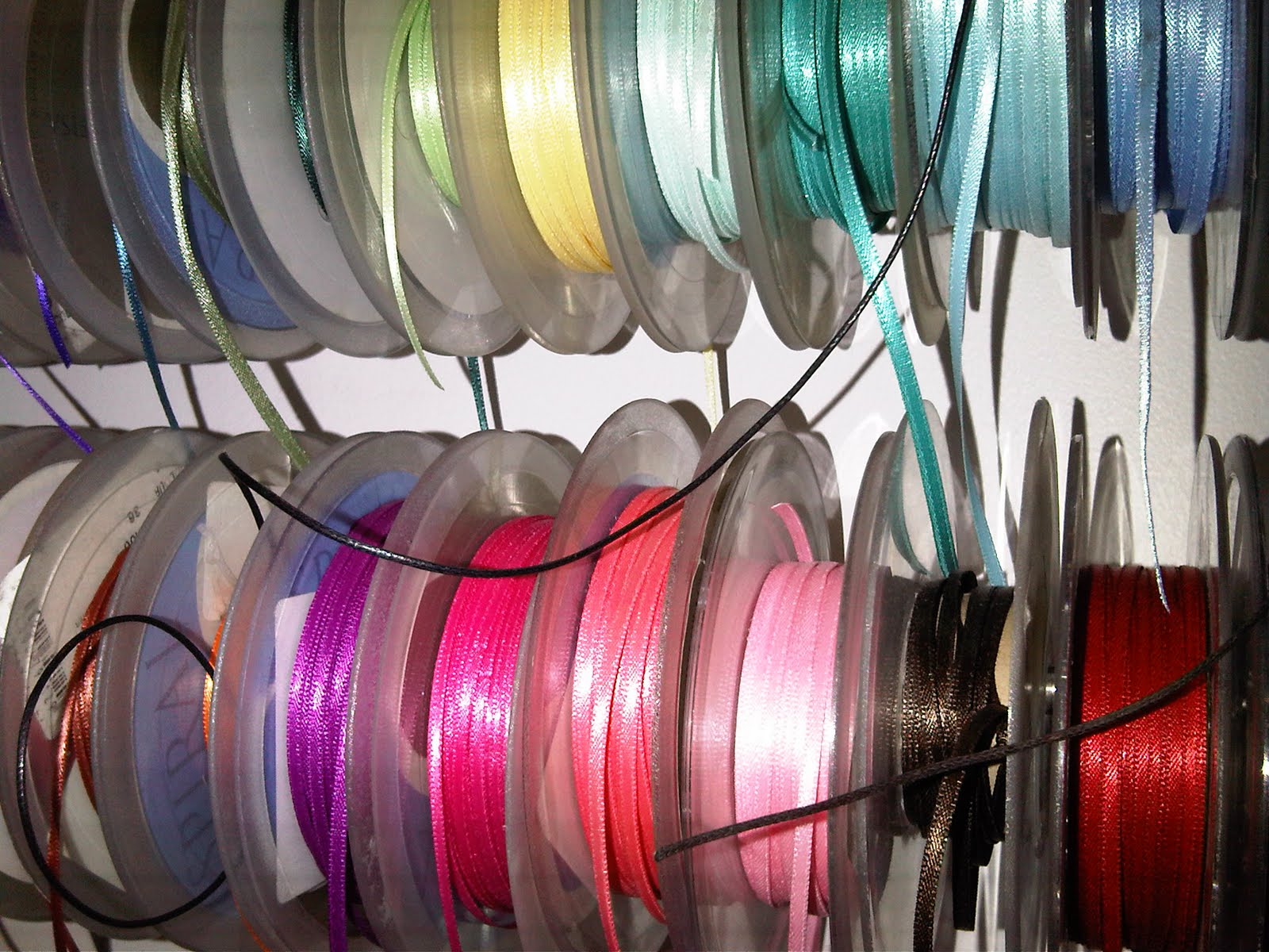
After giving my ideas a little more thought, I felt how I attached them was really important and chose to try and find some really nice ribbon that would work well with the products and the stock I printed on. I was a little bit overwhelmed with the amount of choice i had once I started to look. Eventually I chose a thin light brown to keep it 'bread like' and that wasn't too overpowering against the tag design.
(I felt a little bit like a kid in a sweet shop when looking through the choice!)


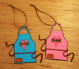
These are my most recent photographs of the new Hovis tags. These are my final designs and will be attached onto the final products. below are the tags on their own. I'm really pleased with the way that they've come out. They just make that extra touch I wanted. The initial tag idea for them to be in the shape of the logo worked, but was a bit obvious and boring for me. I also wanted to try and exploit my illustrations a bit more and apply them to another product.


- Stock
- String
- Scale
- Shape
After giving my ideas a little more thought, I felt how I attached them was really important and chose to try and find some really nice ribbon that would work well with the products and the stock I printed on. I was a little bit overwhelmed with the amount of choice i had once I started to look. Eventually I chose a thin light brown to keep it 'bread like' and that wasn't too overpowering against the tag design.
(I felt a little bit like a kid in a sweet shop when looking through the choice!)

These are my most recent photographs of the new Hovis tags. These are my final designs and will be attached onto the final products. below are the tags on their own. I'm really pleased with the way that they've come out. They just make that extra touch I wanted. The initial tag idea for them to be in the shape of the logo worked, but was a bit obvious and boring for me. I also wanted to try and exploit my illustrations a bit more and apply them to another product.


New Tags!
I'm starting to really have fun with this brief and feel I might be getting a little carried away wanting to keep producing more for it when really, it just needs to be put to bed now. I focussing on the final touches now though and have produced some new product tags I feel are more relevant to my designs.


Subscribe to:
Posts (Atom)
