Thursday, June 3, 2010
Evaluation of Brief
I feel this brief definitely had it's ups and downs. In the whole I really enjoyed it and it's allowed me to learn a lot of different print processes and be able to apply my illustrations to an exciting range of products. It took an interesting twist towards the beginning when I had to change my products and designs for it, but in the long run I feel it served me for the better and I am pleased with the products I have produced. because of the brief being extended and it having to be developed further I did end up spending far more time on it than I had hoped.

Final Presentation Boards
Over all I am relatively pleased with the outcomes of this brief and feel that because I ended up producing so much for it, the boards would end up being a little bit cramped trying to accommodate them all. However after showing my initial boards in the final crit last week I came away feeling like I wasn't good at doing boards at all. With good feedback and helpful notes I have however decided upon these as my final presentation boards for the brief. The layout is far more spaced and continuos and I had edited out all the un-needed annotation. The boards should speak for themselves.


Development Boards
Again with the presentation boards for this brief I'd got it wrong. I'd started off trying to guide the viewer through my project. I'd included lots of text almost describing everything and crammed in all my images over four boards. There is just too much going on in too little space. I got valuable feedback from the crit and came away feeling far more confident with them and a focus of how I could improve them. I also knew I needed to follow the bookend method of having a really strong impact board first and a strong image board to end with. Looking back now, these aren't very well thought out...


Tuesday, May 25, 2010
New/Final Tags
I went away from my last crit with a few things to consider with regard to my tags.
- Stock
- String
- Scale
- Shape
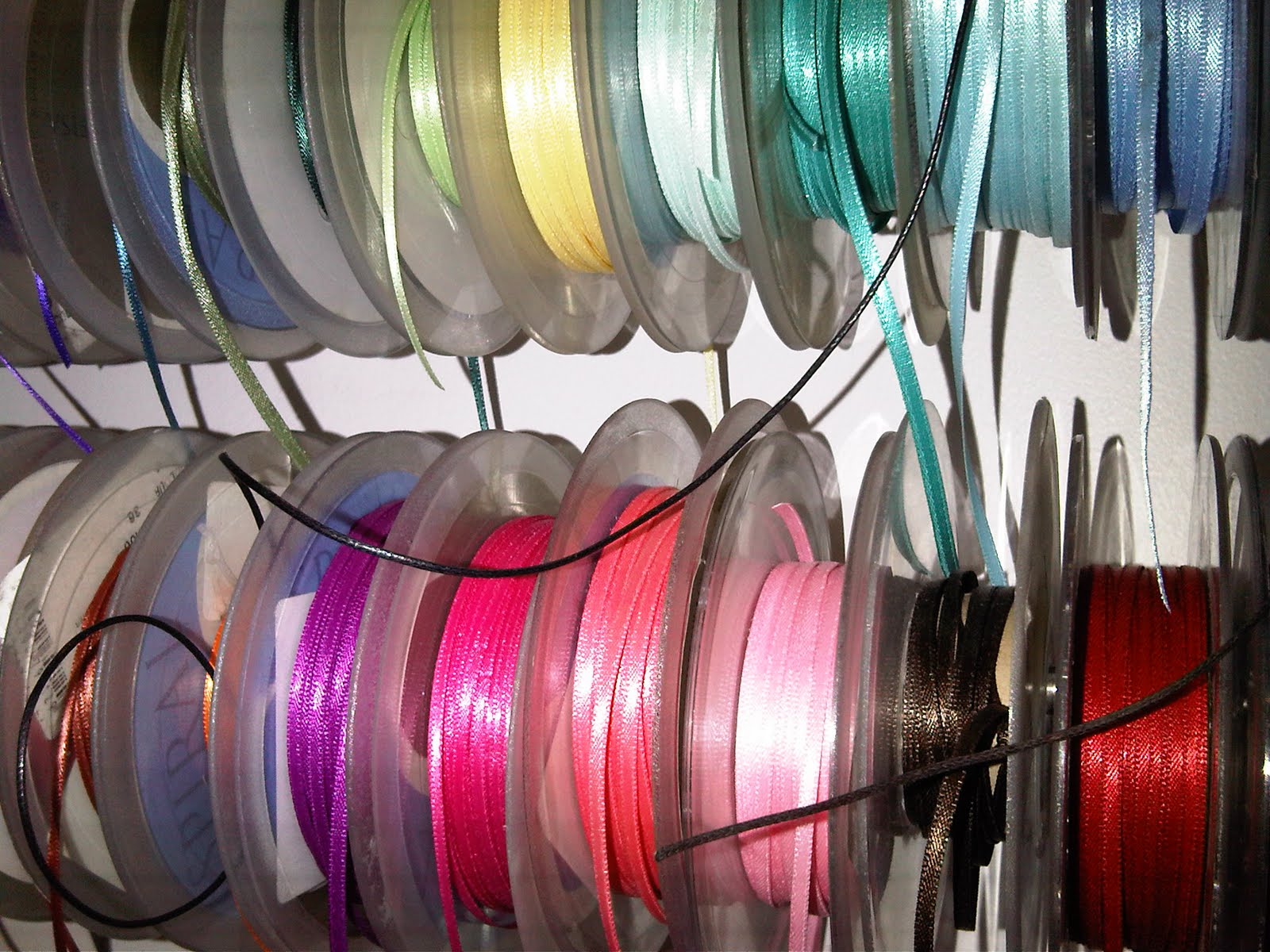
After giving my ideas a little more thought, I felt how I attached them was really important and chose to try and find some really nice ribbon that would work well with the products and the stock I printed on. I was a little bit overwhelmed with the amount of choice i had once I started to look. Eventually I chose a thin light brown to keep it 'bread like' and that wasn't too overpowering against the tag design.
(I felt a little bit like a kid in a sweet shop when looking through the choice!)


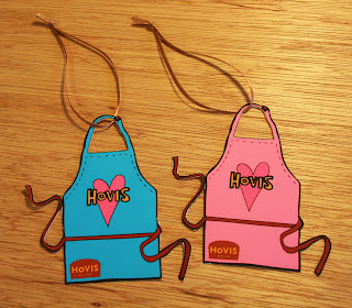
These are my most recent photographs of the new Hovis tags. These are my final designs and will be attached onto the final products. below are the tags on their own. I'm really pleased with the way that they've come out. They just make that extra touch I wanted. The initial tag idea for them to be in the shape of the logo worked, but was a bit obvious and boring for me. I also wanted to try and exploit my illustrations a bit more and apply them to another product.


- Stock
- String
- Scale
- Shape
After giving my ideas a little more thought, I felt how I attached them was really important and chose to try and find some really nice ribbon that would work well with the products and the stock I printed on. I was a little bit overwhelmed with the amount of choice i had once I started to look. Eventually I chose a thin light brown to keep it 'bread like' and that wasn't too overpowering against the tag design.
(I felt a little bit like a kid in a sweet shop when looking through the choice!)

These are my most recent photographs of the new Hovis tags. These are my final designs and will be attached onto the final products. below are the tags on their own. I'm really pleased with the way that they've come out. They just make that extra touch I wanted. The initial tag idea for them to be in the shape of the logo worked, but was a bit obvious and boring for me. I also wanted to try and exploit my illustrations a bit more and apply them to another product.


New Tags!
I'm starting to really have fun with this brief and feel I might be getting a little carried away wanting to keep producing more for it when really, it just needs to be put to bed now. I focussing on the final touches now though and have produced some new product tags I feel are more relevant to my designs.


Thursday, May 20, 2010
New Products!
After my slight change in direction, I have used my existing illustrations and applied them in a different way. I have decided to keep to my initial pattern idea, but make it a repetitive pattern using just one illustration linked to the product it is applied to. These are the products that I have produced in response to the brief. I would however like to further this brief again and extend it a little further. I'm having so much fun with journey it has taken, from an initial short fun brief, to something I really want to push and exploit as much as I can. Enjoy the product shots :)

Oven Glove...
When I first set out to tackle this brief I knew I wanted to produce an oven glove. Not too sure it was the best of responses as it it rather an obvious one to produce, but none the less here it is! I'm pleased how the change of pattern has strengthened the design and feel it works a lot better than my first attempt which featured all the illustrations on.


Chopping Board...
I think this is possibly my favourite of all the products. I applied the pattern by using a transparent vinyl sticker, which I printed using the laser printer in our digital print facility. At first I was going to try and screen print, but I'm so pleased i didn't. It's just come out so well, much better than I had initially thought as I was a bit worried that it wouldn't stick to the wood. I think what I like about it most is that you can still see the grain of the wood peaking through the sticker which almost gives a bread effect to the toast in the toaster! I also feel the colour compliments well with the colour of the chopping board.

Spatula...
My worry with this and also with the wooden spoon is that they might be a little plain looking against the other products and not fit into the set. However the more I look at them I think had I tried to apply some sort of a pattern to them, they might not have looked right at all. Neither has much of a surface area to them that would allow me to apply well to them. I feel had i tried to it would have looked messy and too crowded.

Wooden Spoon...
The Hovis logo has been adapted here into my own illustrative response. I opted to apply the logo onto the back of the products because when researching them I found that this was the most popular design. Also the contents that is being stirred/scooped etc would cover the logo more if it was on the inside.


Rolling Pin...
I didn't know if the transparent sticker vinyl would be adhesive enough to stick to the wood for this design. Especially as it had to wrap the full way around the rolling pin. I was surprised to see that it had a really effective result. I think the pattern works really well as the pin rotates when rolling and the colours really compliment the wood it's made from. The only difficulty I had with this was getting the sticker that wraps around it to line up exactly so that the illustrations of the rolling pins on it would be evenly spaced.


Place Mat...
Although the illustrations are slightly smaller on here, I feel that the egg cup is working well for the design. The colours could have been a bit more vibrant however. When compared to some of the other products, the colours haven't come out quite as well. This has also happened with the tea cosy and the oven glove. The only thing I can out this down to it that I heat transferred onto these products which was a different process to vinyl stickers and digitally printing onto the material. To do this I printed using the laser printer onto heat transfer paper and then ironed my designs onto the products. It was quite tricky at times due to the folds and hemming in the material and also the texture of the material. I found that sometimes the design wouldn't take in certain areas and was a little disappointed to find when I peeled the paper back it was slightly patchy. Over all, despite it being a tricky and time consuming process, I feel that they have come out reasonably well.


Tea Cosy...
Again the illustrations are slightly smaller on this product, however I feel that the repeat pattern works much better on it as opposed to a compilation of all my illustrations together.


Tea Towels...
The tea towels were an addition to the products I wanted to produce. I was initially only going to do one design for them like I was for the apron. However at the last minute I decided to do a pair that could be sold together rather than just one on it's own. My only criticism with them is that I would have liked the cups to have been a little smaller and the Hovis fill on the logo to be the same colour as the coffee in the cups. The brown I chose was just too strong and I don't think it goes as well with the pattern. Chosing the colours for my aprons and tea towels were difficult because the colours always print slightly differently to that you see on screen. And then once you have printed you need to leave the material to dry and come back 24 hours later to steam your products. Once steamed the colours change again!


Aprons...
I prefer these so much more than the first apron I produced. After coming away and developing the illustration pattern further and changing the colour pallet I feel it has aided my designs no end. Even though when I first produced my oven glove and apron at the beginning of the project I was really chuffed with it. (It just goes to show, there is always room for development and improvement.) My thoughts on the products change all the time and I think this has a lot to do with the fact i've been looking at the designs for far too long now. But I really feel that the repeat pattern of the aprons on the aprons look so much better. It gives it a bit more structure and it's not so jumbled. I tried to make one slightly more masculine by making a blue one. However I don't think this was overly successful as now I've mocked it up I still feel the blue one looks a bit feminine! All criticisms aside, this is probably my second favourite product out of them all. If I had to change anything about them, I would re-assess the colour decisions.
Subscribe to:
Comments (Atom)
